Showing posts with label Verve Stamps. Show all posts

Thursday, May 19, 2016

Ready for a nap???

Well I am ready for a nap!  

I had my first ever gall bladder attack this past Saturday evening.   It didn't let up, so I got tests, and then surgery!  

Though I feel better every day, I am still ready for a nap!

Well, six months ago, I became a part of the "Dirt Pile"  a.k.a. SplitCoastStampers design team.  My work was displayed in an amazing members only gallery!

I can now show you some of those cards!
The theme was "A Long Winter's Nap":

Stamp Credits: Starving Artistamps;


Stamp Credits: Starving Artistamps;


No stamp used here, just a coloring page resized for a card;


Stamp Credits: Rubbernecker Stamps for backgrounds (They are the best place for background stamps!!!); and  Verve for the coffee cups and sentiment;


I hope you enjoyed this little walk down memory lane with me... Now I am going to nap... ;)


Please post a comment if you have any questions about these cards or any other cards on my blog.
~Thanks!

Friday, August 30, 2013

Ruffles and Prayers

My design inspiration comes from the A Day For Daisies Blog, today.  The challenge is to use a ruffle on our projects.
Digital Stamp: Tender Thoughts from A Day for Daisies; Sentiment: Serenity from Verve;
 I love how innocent this image is.  Like other A Day for Daisies images... it was a joy to color.

The ruffle is punched lace (a Martha Stewart punch).  I punched it out of office paper so it would make a ruffle easily.  The hidden edge is sandwiched with super sticky double sided tape.

Thank you for stopping by... perhaps you can play with the ADFD Challenge, too!

Thursday, February 10, 2011

HIS Banner Over Noah is Love!

Almost four weeks ago, a dear friend of the family had a baby with a heart defect.  Thankfully (and I choose to call this miracle #2—#1 is his life) they found the heart problem prior to birth, so his mom could give birth at a children’s hospital with specialized physicians, nurses, and equipment.

He has left the NICU this week and I thought that was cause for a paper-crafting celebration!

Banner for Noah

In between the pennants with his name are some quotes that I thought would be appropriate hanging near him.

quote 2 quote 3 quote 4 quote 5quote 1

The hearts are from a Verve Stamps set: Wild Thing.  The quote “the joy of the Lord is my strength” is from the Verve set: Serenity.  The Philippians and Psalms verses are Plane Janes, also from Verve.  Finally, the “I believe in Miracles” and Hebrews 11:1 are from Rubbernecker.

The ribbons are from May Arts Ribbon.

Shape dies are from Spellbinders and the alphabet is from Sizzix.

The patterned paper is from “Me and My Big Ideas”

I hope Noah’s family and caregivers find this to be an encouragement!

~Juliana

Wednesday, July 01, 2009

Color Throwdown #49 and Good News!

Guess WHAT!?! I have FABULOUS news!! I am honored to be the July Guest Designer for Color Throwdown!


How COOL is that!?! (pretty cool, if you ask me!!)

Here are this week’s colors:


And here is my card:


Materials: Stamps: Wild Thing and Psalm 37:4 by Verve; Paper: DP by American Crafts; Prism Super Smooth Cream; Chocolate Chip by SU!; Ink: Memento Rich Cocoa and Adirondack Salmon; Other: corner rounder; ribbon; Spellbinder’s dies; foam tape; marker;

Make sure you check out all the fab DT samples this week!

• LeAnne Pugliesi - Wee Inklings
• Barbara Anders - Paper Pursuits
• Broni Holcomb - Splashes of Watercolor
• Tammy Hershberger - Stamp Happy
• Cathy Indelicato - Crafty Thoughts


Please join us with these great color and link your creation back to the Color Throwdown Blog!


Sunday, May 31, 2009

Trust

This verse is the first Scripture verse that I ever learned.  I worked in a Swedish imports shop and one of my co-workers taped this verse on the cash register.  Since then, it has been a comfort and a re-direction when things get crazy and there seems to be no earthly logic in a situation.

KK-Proverbs 3-5

The flowers  and grasses are a Kittie Kit—the Outdoor master.  The butterfly is a butterfly inchie, also from Rubbernecker.  The verse is from Verve.

The flowers and butterfly are stamped with Tim Holtz Distress Ink and the scene is stamped on Prism Super Smooth White. 

The DP is from Basic Grey.

The ribbon is a soft, yummy and from May Arts.

Have a great day!

Saturday, May 30, 2009

If it ain’t broke…

…don’t fix it.

Do you know that saying?  It was popular in my family—which means we probably did things the same way over and over again.

I did a card for the SCS color challenge this week using Sherry’s “inky thing I do” technique.  I liked the way it came out—so….

CTD44-Rejoice

The same basic layout, similar stamps, but using the Color Throwdown #44 colors:

throwdownswatch44

What I did:

First I stamped the sentiment with StazOn (this paper is gonna get wet so a waterproof ink is needed—and I tried stamping the sentiment last with less-than-wonderful results).

Then I stamped the flourish with Barely Banana Craft (pigment) ink and embossed it with a clear-glittery embossing powder.

For the inky colors on my non-stick mat I used Tim Holtz Distress Ink: Weathered Wood and a touch of Dusty Concord (just a little—it is such a STRONG color that it overpowers the Weathered Wood (bordering blue)).  Following the technique, I inked the paper, and heat set it to dry.

The butterfly was first stamped on the card then on vellum and cut out.

STAMPS: Flourish Set and Butterfly Inchies from Rubbernecker; Plain Jane verse from Verve;

So I am sorry if I am in a small rut (as I was finishing the card—I thought of a dozen or so ways I could have done it differently). AND, thanks for stopping by!

Thursday, May 21, 2009

Clean, Simple and Bright

Just a couple of clean and simple cards, today!

The first one is for the CAS15 challenge at SCS.  We were to use mainly black and white--with just a touch of a bold bright color. I chose Gable Green.

CAS15-Isa61-3

Materials:

Stamps: Flourish from the Flourish Set by Rubbernecker; Isaiah 61:3 from Verve

Paper: Prism: Simply Smooth and Black; Gable Green SU!;

Ink: Stazon Jet Black and Gable Green

Accessories: jewels, foam tape, ribbon, punch;


This next card is for a layout on a clean and simple blog: Clean and Simple Stamping.  It is my take on Fall-to Layout #41.  I switched the sentiment and ribbon.

FTL41-Stay Cool

It is difficult to see in the photo but the drinks have stickles applied to the bubbles before the glaze is applied over top.

Materials:

Stamps: Party Time Set form Rubbernecker

Paper: Prism: Simply Smooth, black, Sunflowers Light and Medium

Ink: StazOn-Jet black;

Accessories: Colored pencils, crystal effects, stickles, deco scissors, ribbon, foam tape

I am off to get some more cards done—one for a little girl who turns one tomorrow—and she underwent open-heart surgery last Thursday.  Her name is Addison if you would like to help me pray for her continued recovery.

Thanks for stopping by!

Saturday, May 09, 2009

Ramblings and Mojo Madness

As a milestone birthday approaches I am have times of reflective thought.  Today’s reflective question is why do I blog my stamping.
The number one reason is to chronicle my “adventures”.  I do not keep many of my cards (just the ones I deem ugly and unworthy to go into other’s hands).  They get given as gifts, sent to rubberstamping companies, sold (not so much any more) and a select few get sent out to people as actual greeting cards.  So I have very few cards on hand.  The ones I do have on hand were made 3-4 years ago—and should end up in the recycling bin.
In just browsing a few folders I came up with some of my favorite cards of the winter of 2007-08.  Feel free to take a gander. 

On another note; I made a card for this week's Mojo Monday Madness.  I used one of my new Verve Plain Jane Scripture Stamps.
Mojo85~JMS
Deets:
  • Stamps: Phil. 4:13 from Verve; Abstract Floral and Floral Silhouettes Set from Rubbernecker;
  • Inks: Tim Holtz Distress Ink: Broken China, Shabby Shutters, and Brushed Corduroy;
  • Papers: Prism: Simply Smooth Ivory, Spring Willow Light, and Island Mist Light; Dp from My Mind's Eye; close to cocoa (SU!)
  • Accessories: May Arts Ribbon; jewels; embossing folder; deco scissors;
Thanks for stopping by. 
I hope every one has a happy Mother's Day!


Saturday, May 02, 2009

Catch up post

Doesn’t that sound like it should be on a burger??

Anyway—I been doing some stamping for fun and for REAL LIVE PEOPLE—LOL!  And I just wanted to show all of my virtual stamping friends what I am up to.

CAS11-Happy Birthday Yapples

CC216-For the love of coffee

CPS113-Fabulous 40 BLING

Thank you gift

I hope you are having a great weekend!!

Tuesday, March 10, 2009

The Joy of the Lord

The best laid plans....

I had planned to use the Verve Challenge Sketch this weekend--but it just didn't work out.  Well, it didn't work out for this weekend.  Stamping and weekends just never works out for me...*sigh*

Anyway, here is my card.  It was a great sketch just not at a good time for me.

Joy of the Lord

The stamp set is Serenity Prayer. 

The dp is by Making Memories.

Make sure you stop back tomorrow for  Wacky Wednesday!

WACKY WEDNESDAY BUTTON


Sunday, March 08, 2009

Serenity in a JAR

One of my FAVORITE people is the Featured Stamper this week on SplitCoastStampers, Judy!

She has a beautiful way of looking at life--and she is a SUPER talented stamper!

Here is HER card I chose to case (it is from this post).

And here is my version:

FS109-Serenity Prayer-JMS

Things I kept:

  • the Serenity Prayer (mine is by Verve)
  • the basic layout (she is so much better at layering than I am, though)
  • the basic details

The things I changed:

  • colors
  • some minor details--scalloped squares, pearl paint for pearls, ribbon
  • added pin (instead of pearl) and fabric (actually quilt binding--instead of the vertical paper strip)

I have another card in mind---it might get made--it might not--we will see what this week brings.

Congratulations, Judy--I cannot think of a more deserving stamper/friend!


Thursday, November 06, 2008

Some Verve Sketch Fun

To celebrate some up coming releases Verve Stamps is having a Sketch Blitz on their Member Forum at SplitCoastStampers.

Today I decided to tackle sketch #3.

I used my Verve set: Serenity. This is such a handy set to have on hand.  It is appropriate for so many occasions.  For any time a loved one is in need of encouragement.  Either male or female.

The dp is from KI Memories and Making Memories; the cardstock is mostly SU! but the lighter blue is from Bazzill.

The ink was Frayed Burlap Tim Holtz Distress Ink.

VSHR3-Serenity

One sketch down--four more to go!!

Thanks for looking!


Thursday, August 07, 2008

More Sympathy

A rough week at work for dh.  He needs another sympathy card.   Not to mention that the staff has lost three (all elderly) dogs in the past 6 weeks.
Serenity Sympathy
I used the Verve set, Serenity.  I intended to use this weeks sketch, but it got looking a little fussy.  I generally like sympathy cards to be a little more simple.  I did get to use my new "29th Street Market" paper by My Mind's Eye.  Yummo!!  To stamp on, I used SU!'s Whisper White mainly because dye ink tends to pool up on polymer stamps--and this paper seems to re-distribute the ink so it isn't splotchy.
Materials Used:
  • Stamps: Serenity (Verve);
  • Paper: Whisper White and Really Rust; DP="29th St. Market" (MME);
  • Ink: Old Paper and Tea Stain Tim Holtz Distress Ink (Ranger);
  • Accessories: Dew Droppy Thingies (Michael's); Sponge;
Thanks for looking. I sure hope my next project will not be a sympathy card!
 

Saturday, April 12, 2008

Verve Mojo

Julee Tilman, has presented some WONDERFUL challenges this week!

First of all on her blog is the Mojo Madness #32 CONTEST.  I have to tell you--I STINK at contests.  The just suck the inspiration and creativity right out of my brain.  But on the other hand--If I just tell myself, "Jules, it is JUST a SKETCH!!"  Perhaps I can actually finish it (an NOT have it look like my 4 yr old did it).

THEN, on the Verve Visual Blog is an "Vervalicious" (her word not mine--but I like it) inspiration challenge (also a contest). Well, are these pillows not absolutely gorgeous??

I just love the colors, and the patterns.  So I figure, lets combine them, and if I do a card that looks like I used crayons and stickers, then I will have only wasted the time and materials for one card than two.  RIGHT??


I pulled out my Verve Visual Wild Thing set (I got it after Valentine's Day--so most of the stamps have never been inked).  Mojo32 Magic Please understand--I was a Rubber Snob--I went kicking and screaming to the Photopolymer side of stamping.  And now--I am a convert!!!
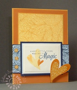
I loved being able to line up these images by seeing through the block and the stamp!  HOW FUN IS THAT!!

I am fairly happy with how the card turned out.  I am REALLY happy with this color combo!!  Don't they look great together??

Anyway--thanks Julee for the sketch and the inspiration--I WOULDN'T have done it without you!!

Materials:

  • Stamps: Wild Thing (Verve Visual); Fern Leaf Tooled Leather (Starving Artistamps);

  • Inks: Night of Navy, So Saffron, Apricot Appeal (SU! Craft), Pumpkin Pie, More Mustard (SU! Classic), Yellow Ochre (Colorbox Fluid Chalk Ink)

  • Paper: White, Bashful Blue, Pumpkin Pie, More Mustard, So Saffron, Night of Navy;

  • Accessories: Punch, pearlescent paint

Thanks for stopping by!

Blog siggy

Thursday, March 13, 2008

He is Risen!

I sincerely hope to get some Easter cards out this year. With it coming so early--we will not be celebrating with any family.


I was very excited when I saw the set Easter Elegance from Verve Visual!! It is just what I wanted for an Easter set!


The layout is from a sketch from Sweet Miss Daisy. It was perfect for the papers I set out last night after I cleaned my desk. The designer papers are from K & Co. The main image is on Pearlized Cream paper I got from Verve.


I stamped the image and the sentiment with Chestnut Roan Fluid Chalk ink by Clearsnap. (it is one of my favorites). Then I simply used my colored pencils to highlight the cross, and inked the edges of the main image with Close to Cocoa Classic ink.


It was such an easy sketch for this set--the card came together cleanly and easily!


Now--the next challenge is to get this puppy in the mail (I really stink at that!!)