Thursday, July 31, 2008

Remembrance

Just a quick post today!

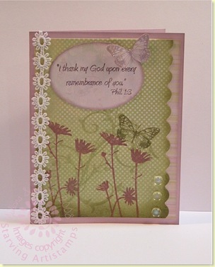
Last week I was able to participate In the Dirty Dare '08 challenge with Joan Ervin. She asked us to use silhouette style stamps. COOL! It is one of my favorite styles to use. I love the ones from Starving Artistamps.

DTGD08Joan rememberance

Materials Used:

  • Stamps: Butterfly (sm. freak 1.6); Daisy (FS-9) ; and Phil. 1:3 (Faith Sentiment Set); Baroque Motif (SU!);
  • Paper: Sprout DP (Memory Box); Pale Plum (SU!);
  • Ink: Warm Violet Fluid Chalk Ink (Colorbox); Shabby Shutters, Peeling Paint and Milled Lavender Tim Holtz Distress Inks (Ranger);
  • Accessories: lace (Wal Mart); corner rounder (EK Success); Coluzzle (ProvoCraft); Stickles and Perfect Pearls (Ranger); Sponge

Thanks for stopping by!

Monday, July 28, 2008

Coffee with Holly

One of the sweetest stampers in the world is Holly, a.k.a. Toy on SCS!! She hosted a Dare to be Dirty challenge last week, a sketch challenge. She encouraged many layers. I am ALWAYS amazed on how many layers she puts on--WITHOUT it looking cluttered or overdone!!! I however--can't. I know why--she plans ahead and works out her design in MS Paint before she cuts into a single sheet of paper. I am more of a fly-by-the-seat-of-my-pants stamper.


So here is what I came up with:


DTGD08Holly Coffee


She also makes a lot of her own dp to match her image when needed--I can do that!!


DTGD08Holly Coffee detail


Thanks to Tim Holtz Distress inks, some fine watercolor brushes, and watercolor paper--I have my own dp!


Thanks, Holly for a fantastic sketch--perhaps I will try the MS Paint thing.......someday!


Thursday, July 24, 2008

DoodleFactory Tropics Recap

I just thought it would be fun to put all of my DoodleFactory Tropics cards in one place.

 Fun, eh?

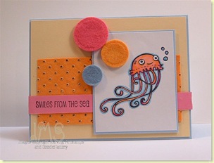
Smiles from the Sea

The Sketch Challenge (#186) on SplitCoast was a fun one!

I stepped out of my comfort zone and into some VIBRANT colors for this card.  (BTW--the colors of the jellyfish and the felt circles, do match--no matter what my camera says!)

sc186 Smiles from the sea

The image is colored with some Prismacolor markers.  Since I only have VIBRANT colors thus far---I am using VIBRANT colors. (LOL!).   The orange handmade paper is a thick felt-like paper with gold embossed dots.  The large felt dots were felt flowers that I used Nestabilities dies to cut into circles.

The stamps are from the Doodle Factory Tropics set and Tropical Sentiments set from Starving Artistamps.

Have a smiling day!!


Tuesday, July 22, 2008

Pretending to be dirty

Over at SplitCoast this week it is Dirty Dare '08.  Where the Dirty Dozen and Dirty Dozen Alumni present challenges so the rest of us (fan club members) can play along.

Today, I got decided to play along. 

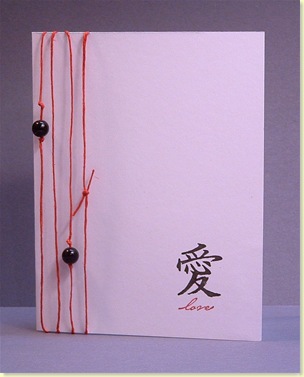
The first challenges that I did were presented by  Herself (Julie HRR) and by Michelle (sf9erfan).  I combined them in one card for my ds.  He has had a hard time with this move.  It may look OVERLY simple--but I know my guy--and it is just fine for him.

DTGD08JulieHRR DTGD08Michelle Love

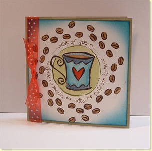
Then next one is for the challenge presented by Christine (Christine Creations).   I don't watercolor as much as I should--it really relaxes me. 

DTGD08Christine Cup of Joe

The words are hand painted and there is an embossed circle around the cup (from using Nestabilities dies).  Here is a detail photo:

DTGD08Christine Cup of Joe detail

Both were fun cards to make.

Thanks for stopping by to look!!


SMILE!

To say that I am not one easily influenced by trends is a bit of an understatement.  The main reason is because I am frugal (yes, you may insert cheap--but I am sticking with frugal).  It was a running  joke with one of my stamping classes--they always knew I would show them the least expensive way to do something if I could.  On the other hand, I do recognize quality, and I am not afraid to spend some extra money for superior products.

Why do I bring this up??  Alcohol markers.  I love the look they give (especially in the hands of experts). But I had a tough time  swallowing the price for them--especially the Copic Sketch markers--which seem to be the top of the line.

So in my frugal-ness, (read: fear of wasting money) I purchased a set of 24 Prismacolor markers to practice with.  I got them off of EBay and the cost was just over the cost of a large stamp set. 

Through this purchase I have determined a few things (some I suspected before--but were confirmed with this purchase):

  1. In  using these markers--it is helpful to have several tones of the same color (hue) to achieve shading. 
  2. Lighter colors are very important.
  3. For coloring stamped images--a brush tip is EXTREMELY helpful (the Prismacolor brand does not have this).
  4. Practice--practice, practice.

So (finally) here is my first stamped image colored with alcohol markers.  Well, the first  STAMPED one I have shown you...

SMILE

I am fairly pleased with the result, and I plan to SLOWLY acquire some Copic (Ciao or Sketch) to fill in the colors started by this set of 24.  I used three colors of blue and the colorless blender.

Materials used:

  • Stamps: puck the dolphin from the Doodle Factory Tropics set;
  • Ink: Palette Noir (Stewart Superior);
  • Paper: dp Basic Grey and Walmart; Old Olive and Brocade Blue (SU); White (GP);
  • Accessories: Grungeboard arrows; Prismacolor markers; tag (EK Success); brad (SEI); dew droppy thingies (Michaels); Diamond Glaze (Judikins); circle Nestablilities (Spellbinders); 

Thanks for stopping by and looking.  I would be interested in your opinions and tips concerning alcohol markers.


Friday, July 18, 2008

Paradise FOUND

Just a fun card for today!


I used the CPS Sketch #73:


In my new home my computer is not near my stamp area--so it seems that every time I do a sketch--there is an error. This time it is the *frame* around the main area of the card. OOPSIE!!


The vellum circle around the relaxing penguin is to let him *POP* a little more.


Materials Used:


  • Paper: Dp (The Paper Loft and Flair Designs); white (GP); Oatmeal (?); Vellum Cardstock (Staples);

  • Accessories: Antique Linen Distress Crackle Paint (Ranger); distress tool (Tonic); Punch (EK Success); brads (CTMH--THANKS STACY!!); Nestabilities (Spellbinders);


Again, thanks for coming. Only one more stop on this tropical vacation! Stay tuned!


Thursday, July 17, 2008

The De-Stressed Spot

I have been fascinated with my friend Shelly use of Tim Holtz inks lately. So I decided to try my hand at a little distressing.  After all, a pirate map has to be OLD, right??

X marks the spot


I used 3 or 4 colors of Tim Holtz Distress inks (don't know exactly since, for once, I cleaned up as I went) and the Inkssentials blending tool on the edges.  It was the first time I have used it. I saw Pat and Bad Sherry use it at the RubberNecker booth in Akron, OH, but I never tried it myself.  I do have to say--it is pretty cool!!  It was more even and more predictable than a sponge.

Materials used:

  • Stamps:  Tropical sentiments; Map and Treasure from Tropical DoodleFactory
  • Ink: Dark Brown and Red Fluid Chalk Ink (Colorbox); Various Tim Holtz Distress Inks (Ranger);
  • Paper: White (GP); Brown DP (KMI); Chocolate Chip (SU!)
  • Accessories: ink blending tool (Ranger); Gold Liquid Pearls (Ranger); Prismacolor pencils + baby oil; foam tape; black brads; distressing tool (Tonic);

Thanks for stopping in here!


Sunday, July 13, 2008

In the Good Ole Asian Summertime

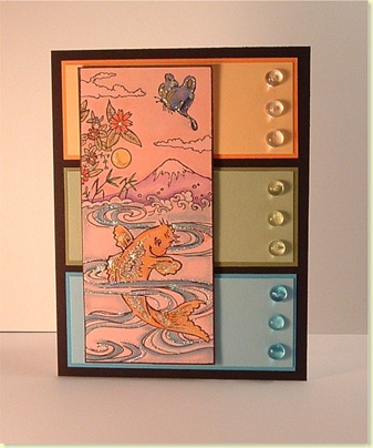
JeanneS hosted the Limited Supply Challenge last Friday.  We were to use Summer themed stamps with a few limits.  I think I flunked the layer limit--Sorry folks.  I totally missed that on the challenge post. 

LSC176-Summer Fish

The image is stamped on pink cardstock to give the image a WARM feel.  The sky is even colored in shades of peach to simulate oppressive heat.   I also chose colors that reminded me of summer for the panels. I tried to enhance the summer feel with some Stickles, Liquid Pearls, Diamond Glaze and bright summer colors. 

This image is by Stamp Oasis from Rubbernecker.

Thanks for stopping  to look!


Relax Refresh Refill

For this card, the Sketch Challenge at SplitCoast was my jumping off point.  The guest hostess was my buddy Cindy (Mothermark).

Surprisingly, the squares turned on the side was a challenge for me, but a good thing to take me out of my routine! 
SC184-Relax-Refresh-Refil
The sentiment *squares* have been misted with a Perfect Pearls and water solution. They have a pearly sparkle in real life. The castle has a bit of Stickles on it to simulate the way real sand sparkles in the sun.
The sand castle is from the Doodle Factory Tropics set. The sentiment is from the Tropics Sentiments Collection #2.

Thanks for being patient between the long wait in my posting stamping projects.  I have had some minor technical difficulties.
 

Wednesday, July 09, 2008

And the winner is...

Here are your random numbers:

5


and that person is:


Donna said...

nope, not me - staying home. Hope I can win these sentiments, they are great!! Hope you have a fabulous birthday!!


Hey Donna, drop me an email when you get a chance (note: the email me button on the right).  Tell me your addy and I will tell you when to expect  your candy.


THANKS all for the kind birthday wishes.  I had a great day!


I am off to stamp, today--so stay tuned for a card! :D


Tuesday, July 08, 2008

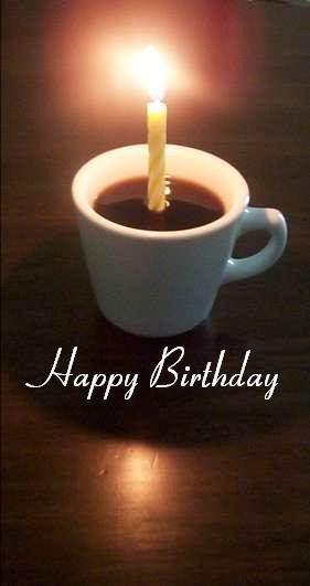
Happy Birthday to ME!

HappyBirthdayCoffee.jpg Happy Birthday coffee image by StevenDance


Just a reminder to go here and comment for a little blog candy!


Mom is on her way--got to go tidy up!


Thanks!


Thursday, July 03, 2008

Birthday Candy!!

Well, I bet most of you are with family and friend celebrating  Independence Day.  But for you lucky ones blog surfing this weekend, I have some blog candy to give away.  How old??  Let's just say Jack Benny and I will have something in common.

If you browse this blog regularly you have noticed the tropical stamps I have been using.  To give away I have a set of the sentiments that I have been using :

Tropics Sentiments 

I plan to add some tropical items to the stash as well.

Just leave me a comment on this post and I will choose a random # Tuesday, July 8th, (my birthday) night.  (Please, only US and Canadian addresses).

Good Luck!!


Wednesday, July 02, 2008

Hang 10 DUDE!

This little Tiki guy makes me laugh his name is Teeko.  I thought he would just love to ride some waves!!  The wave is really from the wave runner stamp, but I omitted the wave runner.  I went a little Stickle crazy--but I think Teeko likes it.  Tee hee!
SC183-Hang 10 Dude
The layout for this card came from the Sketch Challenge (#183) over at SplitCoast Stampers.
Materials Used:
  • Stamps: Teeko, surf board, and wave runner by DoodleFactory; sentiments by Starving Artistamps;
  • Paper: Dp (Flair Designs); Light Green two sided Cardstock (Colorbok); textured Blue cardstock (DCWV); Brilliant Blue CS (SU!)
  • Ink: Dark Brown Fluid Chalk Ink (Clearsnap) Terrific Turquoise marker (SU!);
  • Accessories: Stickles, colored pencils, baby oil, foam tape
These stamps are just toooo much fun!!
 

Challenged Dragon

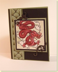
This is my submission for this weeks Rubbernecker Blogger Challenge (#16) and the SCS Color Challenge (#173).

The RBC #16 asks for the use of Grungeboard or chipboard.  I used some flourishes from the  Grungeboard Minis set.   I inked them black and then spritzed them with a mixture of Black Soot ink, Perfect Gold Perfect Pearls and water. The flourishes are VERY sparkly IRL--Trust me!

For the color challenge (Purely Pomegranate, Wild Wasabi, and Certainly Celery) I substituted Old Olive for the Wild Wasabi, since I don't have any WW.   The border is watercolored with varying saturations of old olive ink and then some certainly celery ink.  The Dragon is watercolored with Pure Pomegranate ink--for depth it is tinged with black soot and worn lipstick (TH Distress ink) in some places.

I had a lot of trouble photographing this--I have not perfected my photo set up at the new house.  The contrast on the dragon is a little greater--but again, you have to trust me on that one. ;)

RBC16--Dragon

Materials Used:

  • Stamps: Asian Stamps from Rubbernecker;
  • Ink: Purely Pomegranate, Old Olive, Certainly Celery (SU!) Black Soot and Worn Lipstick Tim Holtz Distress Ink (Ranger)
  • Paper: watercolor paper, Old olive, certainly celery and black from SU!; light celery (Colorbok)
  • Accessories:  watercolor brush, grunge board, mini mister, perfect pearls

Thanks for stopping by!!


Tuesday, July 01, 2008

Yo, ho ho!

What is better than a Parrot Pirate!!


I think this guy is great!!  His name is Buck-Eye Bob--how cool is that. (No, I have NO idea what his parrot is named!)


DF Yo ho ho


Materials Used:


Stamps: Tropical DoodleFactory; Circle Background and Tropical Sentiments (Starving Artistamps)


Ink: Noir-Palette; Broken China, Black Soot, and Tea Stain Tim Holtz Distress Inks (Ranger);


Paper: White (Georgia Pacific); Glorious Green, So Saffron, and Basic Black cardstock (SU!); (Scrap of aqua--DCWV);


Accessories: Coluzzle system (Provo Craft); label holder (SU!); ribbon, colored pencils (Sanford); baby oil + stumps; Pewter and Gold Pearl Liquid Pearls (Ranger); brads (Colorbok)